I find the UI (user interface) does not fit my workflow in the Editor. It has big buttons that take up valuable monitor space. For users with small monitors or big documents, real estate is at a premium. I also find that I do not like the selection of tools found in the default toolbar; is it possible to make the appropriate adjustments to make the Editor more space friendly?
My screen is very large and I have a lot of wasted space, how can I use it more effectively?
You absolutely can make changes to the toolbars in the Editor. Please see below many of the options available to users with regards to customizing the appearance of the Editor's toolbars.
The Editor comes setup with a common layout that benefits the average user with a widescreen monitor. This is the default scheme and the UI can be reset to this at any time should you find that you've made a mistake or lost key functionality and would like to quickly revert to the default layout.
You can also press F11 to enter full-screen mode in the Editor in order to maximize the screen area. Most hotkeys work in this view, including any custom ones that you may have created. (Note that full-screen mode is not optimized for editing documents, which means certain features are not available, and the full screen navigation features may take precedence over them).
If you are unfamiliar with how the new Ribbon UI, or Classic UI operate, please take a look at this KB: https://www.pdf-xchange.com/knowledgebase/517
More information on full-screen mode is available here: https://www.pdf-xchange.com/knowledgebase/455
The default style of toolbar is quite thick in comparison to the Viewer:
Editor V9:
Viewer:
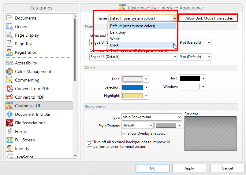
Dark mode is available in PDF-XChange Editor, but it is disabled by default. You can manually enable it, or activate an option to ensure it changes in accordance with your currently selected windows theme (note that this options is for users who switch theme mode with some frequency).
If you want to enable dark mode, then open the preferences with Ctrl+K, move to the "Customize UI" category, then select either "Black" or leave the setting on "Default" and select the "Allow Dark Mode from system" box. Note that manually selecting any option in this list will disable any automatic changes taken from the system theme.
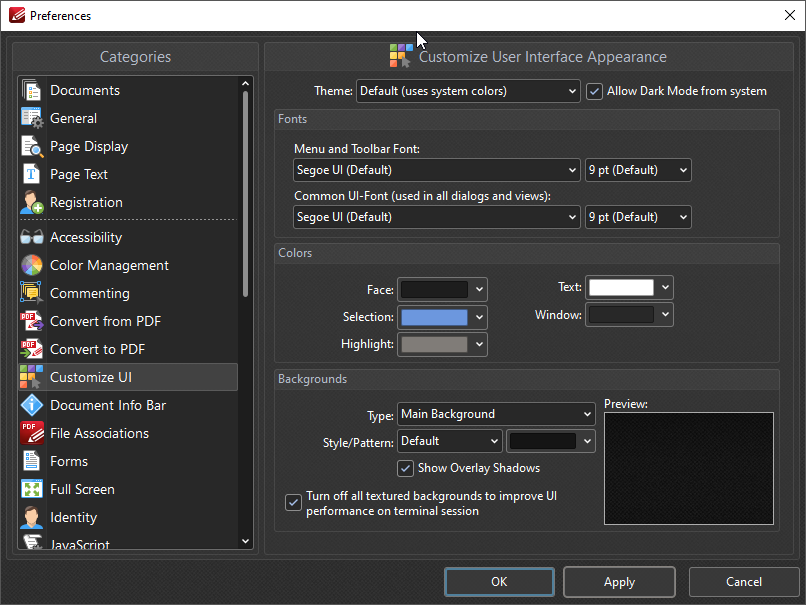
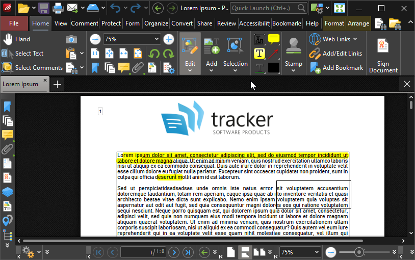
When dark mode has been enabled the UI will update as detailed below:
If there is a function you cannot locate, we now offer a Quick Launch function, located by default in the top right area of the Editor:
Simply search for any command that you are trying to locate, and you can make quick use of it by clicking on the tool from this menu.
If you would like to add one of these tools to the toolbar, you can click and drag the tool to pick it up and place it in a location of your choosing:
Clicking the arrow or pin (detailed below) will allow you to Compress, Expand, and Hide the toolbar.
Above is the Default View. Detailed below is the Unpinned View. This mode is ideal for users with minimal screen space as it is possible to click headers in order to open/close ribbon tabs:
Note that the toolbar is thinner in the unpinned view, and you can double-click headers to expand and pin the relevany section of the UI open.
This New UI will resize and remove some of the unnecessary text depending on the width of the editor window.
**If you've hidden the toolbars and cannot get them back, See This KB
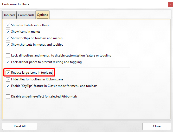
If you want to reduce the size of tool icons, then right-click a toolbar and click Customize Toolbars, then navigate to the options header and select the "Reduce large icons in toolbars" check box:
Many users found that even the above proved to take up too much space in the Classic UI layout. We have now removed the properties toolbar, and replaced it with the Format tab, which minimizes with the other headers when the toolbar is unpinned.
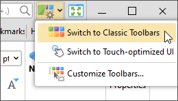
If you prefer the Classic UI layout, then you can switch back to it at any time by clicking on the UI Options dropdownmenu and selecting Switch to Classic Toolbars:
Note that it is also possible to minimize the icons detailed in the Classic UI, as detailed below:
**Note: many of the menus change slightly with this layout. If you are using the Classic UI and encounter an issue for which you must ask support for help, then please include a note that you are using the Classic UI in the initial email so we can assist you better.
It is necessary to unlock toolbars before you can customize their buttons. Right-click the the toolbar and select Unlock Toolbars to do this:
Right-click a toolbar and then click Customize Toolbars to enable the adding or removal of tools within the toolbar.
Moving tools: click and drag existing tools to move them to your desired location.
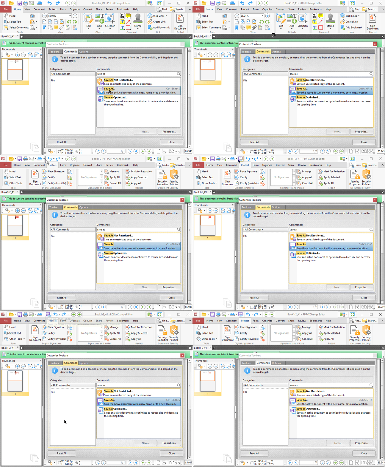
Adding tools: move to the Commands tab and then type the name of the tool/command you would like to add. For example, you can relocate the Save As command as detailed below:
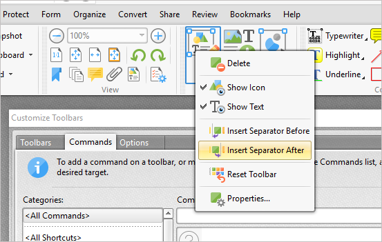
You can also Insert Separators between tools/commands. Simply right-click when the Customize Toolbars > Commands window is open and select the desired option in the dropdown menu:
**Note that you are now able to add tools to the title bar as well as the toolbars.
Remove: To remove a tool from the toolbar, simply click and drag it into the customize window.
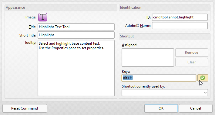
When you are in the Commands section of the customize window detailed above, you can also add or change keyboard shortcuts associated with tools. This is possible in the properties section for the tool, as detailed in the Highlight Text tool below:
You can the specify a new shortcut for the tool - the example above uses Alt+H. Note that you must use the desired action when assigning keys (i.e. pushing the two keys instead of typing a,l,t,+,H). If there is a conflict, then the Editor will provide a warning and the shortcut will not work.
You can contact us by phone, email or our social media accounts — we are here to assist you.